this muti-exposure taken on 35mm film with a Diana F+ shows elements of good composition through symmetric balance of proportional streets, unity rather than variety in terms of color, and repetition in terms of subject. i was trying to capture the sensation of being at a crossroads. motion halted, but opportunity bursting at the seams.
this muti-exposure taken on 35mm b&w film with the same camera as above shows elements of bad composition. there is no balance symmetric or asymmetric. it is also disproportionate, and the movement is disrupted due to the incorrect framing. the one element it does get rite is the variety. i was trying to capture a juxtaposition between the rigidity of a car dealership with the malleability of nature's flowers.
this is one of my favorite instagram uploads. taken on my android phone of an anonymous mural artist at D.C.'s Artomatic Arts Festival, this picture has great composition. the only elements i can take credit for however, are the dominance of the mural over the artist, and proportion due to framing. i also like how i captured the artist in motion. it creates the sensation that the artist and her mural are one entity. really, the motion (kinetic and color), the variety of color and even the dominance should be attributed to the artist.
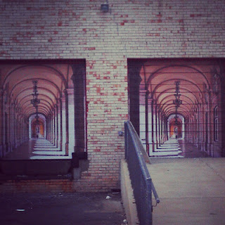
another one of my favorite instagram uploads, this one is interesting and visually appealing, but not very well composed. the elements this image gets right is the symmetric balance, and linear movement. also the illusionary point source of the light emitting from the center column lends to the visual aesthetics. now for the bad: the balance is disrupted due to off-framing, the variety is decreased due to my desaturation of the colors, and the dominance of the structure in the foreground affects the repetition of the "windows", the proportion and the overall unity. still an okay photo though.


