Wednesday, September 19, 2012

LINE kampf

My intent for this was a very minimalist, abstract view of say, the ocean. I wanted the lines to create the effect of looking out into an expanse.

All I could think of was, "This would make awesome wallpaper!" Especially if the fluctuation of line width continued throughout the piece. 

The intent for this one was a VERY minimalist, negative space palm tree. My mind was on the beach :) In order to make it more nonrepresentational, I took the "trunk" out to the corner, creating less organic movement through the piece.

This piece was influenced by the weird building I photographed on my line collection walk. I want to take the advice that several offered to expand the line width as they approach the border. This would greatly add to the "zoom" illusion I was going for.

This was my initial alternative to the width expansion. It kinda created a different effect than I was going for, but I still found it interesting.

This is probably my most effective sketch. It's my personal favorite. And would be a pretty wicked wallpaper also. I didn't know at the time, but it is a total homage to Bridget Riley!!

This one, much like the first, was supposed to represent an abstract expanse. This one was much more representational with "sun" setting on the "horizon." I really don't know what the design in the center is, but i liked it enough. 

This is a very rough sketch. It needs obvious cleaning up. For some reason some of my outlines show through the layers. 

This was my final idea conception. I was kinda tapped on ideas that still fit my original theme, so a bulb went off: Instead of implied shapes, do obvious shapes!

I admittedly got lazy, but I still liked the composition my laziness created.
Here are my 10 sketches the order I made them. I experimented with different compositions, but I did try to maintain a central theme. With the exception of #10, every piece is made up of only horizontal and vertical lines. The lines themselves are pretty uniform and vary very little. 

Tuesday, September 18, 2012

a man amongst lines...


Add caption

I liked the convergence, and the steep contrast between the shadows and desaturated brick tones.


I liked the illusionary depth.

This building is weird, and  most influenced my line designs.
I wanted to take an epic walk and find the best lines the eye could find, but while walking to my car, I realized something amazing. The ordinary lines I typically disregard, (by no conscious fault of my own) can be quite extraordinary! If you take the time to appreciate them...

Sunday, September 9, 2012

subtleties in good and bad composition

this muti-exposure taken on 35mm film with a Diana F+ shows elements of good composition through symmetric balance of proportional streets, unity rather than variety in terms of color, and repetition in terms of subject. i was trying to capture the sensation of being at a crossroads. motion halted, but opportunity bursting at the seams.

 this muti-exposure taken on 35mm b&w film with the same camera as above shows elements of bad composition. there is no balance symmetric or asymmetric. it is also disproportionate, and the movement is disrupted due to the incorrect framing. the one element it does get rite is the variety. i was trying to capture a juxtaposition between the rigidity of a car dealership with the malleability of nature's flowers.   
this is one of my favorite instagram uploads. taken on my android phone of an anonymous mural artist at D.C.'s Artomatic Arts Festival, this picture has great composition. the only elements i can take credit for however, are the dominance of the mural over the artist, and proportion due to framing. i also like how i captured the artist in motion. it creates the sensation that the artist and her mural are one entity. really, the motion (kinetic and color), the variety of color and even the dominance should be attributed to the artist. 
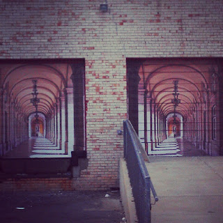
another one of my favorite instagram uploads, this one is interesting and visually appealing, but not very well composed. the elements this image gets right is the symmetric balance, and linear movement. also the illusionary point source of the light emitting from the center column lends to the visual aesthetics. now for the bad: the balance is disrupted due to off-framing, the variety is decreased due to my desaturation  of the colors, and the dominance of the structure in the foreground affects the repetition of the "windows", the proportion and the overall unity. still an okay photo though. 

Tuesday, September 4, 2012

is dat me?

Well no, but this would be me if I were a bass-playing bear named Red. As awesome as that WOULD be, I however, am just... a dude named dunstan.